
Background
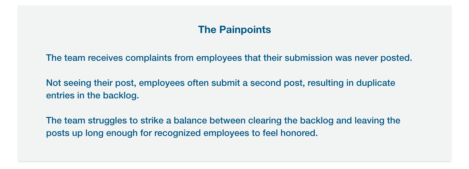
An employee spotlight feature on our client’s SharePoint Intranet site had a problem: people were submitting so many recognitions that it was creating a backlog for the moderator, resulting in a long wait to publish posts. This feature is a grid that displays employees that are being recognized for a good job (High 5), a promotion (People on the Move), or a career milestone (Service Milestones). Every morning, the moderator approves a new batch of recognitions, pushing down the ones from the day before. The spotlight only holds 12 posts per day, yet users are submitting an average of 19 posts daily, causing a backlog overflow and creating a variety of problems.
Project Details
Timeline: 3 weeks | My Role: UX/UI Designer
On this project, I teamed up with a UX architect and front-end developer. As the UX/UI Designer I was responsible for:
Workshop Facilitation. I partnered with the UX architect to facilitate a design workshop with the client team and gain a better understanding of the problem and our users.
UI + Interaction Design. I carried the designs from sketches to mockups to high-fidelity prototypes with animations to demonstrate visual design and interactions.
Deliverables Presentation. I was responsible for presenting our solution ideas to the client virtually. To do this, I created a screen recording as I navigated through the prototype and delivered it to the client via email, highlighting important features and explaining design decisions.
Workshop Facilitation
We kicked off the engagement with a 2-hour UX workshop to better understand the problem, identify user goals and pain points, and brainstorm design solutions. Our participants included a product owner, the person who reviews posts before they are published (also known as the Moderator), and a handful of employees that used the Employee Spotlight feature often.
For the first workshop activity, we worked together to define the purpose of the feature. Everyone wrote their purpose(s) on a sticky note, and as a team, we grouped related stickies together, then had all the participants vote for their favorites.

The main purposes of the Employee Spotlight feature:
• To boost the morale of employees and make them feel good.
• To recognize fellow employees for their hard work.
• To inspire other employees to work harder so that they too can be recognized.
Next, we identified three types of users:
1. Spotlight Employee - the employee who's being recognized.
2. Recognizer - the employee that submits the recognition.
3. Moderator - the reviewer who approves and publishes recognitions.
2. Recognizer - the employee that submits the recognition.
3. Moderator - the reviewer who approves and publishes recognitions.
Next, we split all the workshop participants into three groups. Each group was responsible for a specific user persona and worked together to brainstorm goals and pain points the user might have with the existing feature.
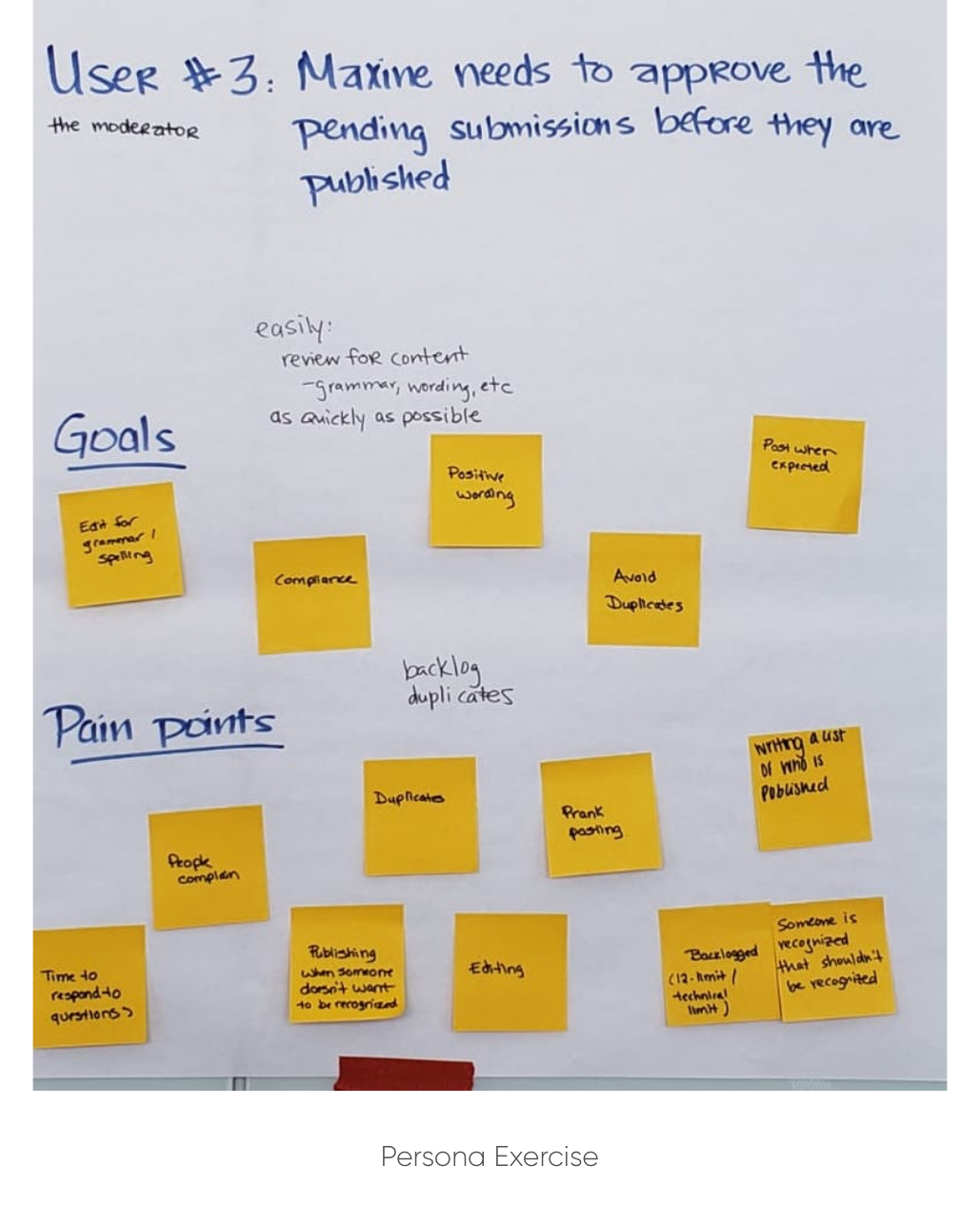
User Persona: Moderator
Primary Goal: To review, edit, and publish the submissions in a timely manner.
Pain Points:
• Not having enough time to respond to questions.
• Managing multiple recognitions for the same person or event.
• Removing duplicate recognitions that were submitted more than once.
• Keeping track of who submitted what and when.
• Finding alternatives for employees that don't want public recognition.
• Managing multiple recognitions for the same person or event.
• Removing duplicate recognitions that were submitted more than once.
• Keeping track of who submitted what and when.
• Finding alternatives for employees that don't want public recognition.
Sketches
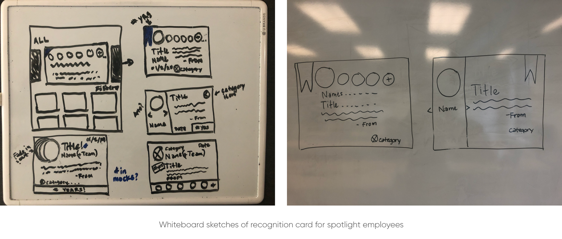
For the last session of our workshop, we did a Crazy 8’s exercise and encouraged everyone to sketch as many ideas as possible within 8 minutes. Later, we took turns sharing our ideas and offering feedback. After this activity, I drew some whiteboard sketches to establish a visual direction for the interface. The size of the recognition cards had a large impact on how the page could be laid out, so I decided to start with those components first. My goal was to create a visual solution that displayed as many spotlight employees as possible without taking up too much real estate. I also had to think through how to display multiple spotlight recognitions at one time. We believed that increasing the number of recognitions on the page and having a “group post” option could help remedy many of the backlog issues.
Wireframes
I designed thumbnail versions of the recognition card, which clicked open into a card module. This truncated design helped free up a significant amount of space and almost tripled the number of recognitions we could display on the page. It also limited the amount of content the user sees at a time, allowing them to focus on what’s most important — the spotlight employee.
For the group post recognitions, I added navigation arrows and supporting verbiage after each name (“and team”) to signify that multiple employees are being recognized. Ideally, every employee in the group post will rotate through automatically but the user had the option to use the arrows to navigate at their own pace. The “Service Milestone” cards also had enhanced visual design to highlight employees' anniversaries.

Deliverables Presentation
Once the size and layout for the cards were set, I transitioned the wireframes into high-fidelity mockups, adding brand colors, fonts, icons, and placeholder imagery for the headshots. Next, I created clickable prototypes to demonstrate how specific interactions, like navigating through a group post or clicking on a thumbnail, would work when the feature was live.
The Outcome
Overall I think we were really successful in our efforts to resolve the backlog overflow. The number of posts that could be showcased on the home page increased from 12 to 32, allowing employees a little more time to enjoy the spotlight. The thumbnail view also helped reduce cognitive load by only showing the information necessary for a user to recognize an employee.
Moving forward, I would like to conduct usability testing and get real feedback from users, including the moderator, to see how the changes we made have impacted their experience.