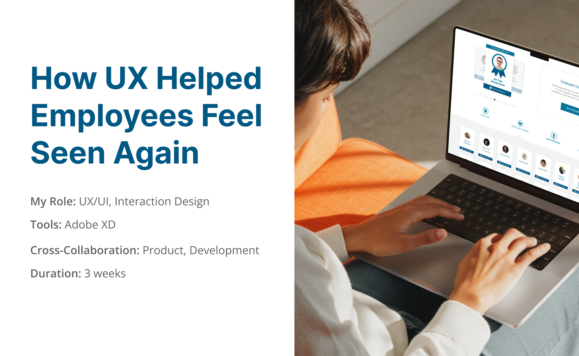
Overview
I redesigned the internal recognition platform for a major energy company's intranet to address submission overflow, reduce moderator strain, and ensure employees were properly acknowledged. By applying user-centered design thinking and scalable UI solutions, I tripled the display capacity and created a smoother, more gratifying experience for both users and moderators.
The Challenge
The recognition platform was intended to boost employee morale but the outdated system couldn’t keep up with demand. Submissions weren’t displaying in a timely manner, employees were feeling overlooked, and moderators were overwhelmed by an inflated backlog and duplicate entries. The original goal of helping people feel valued was getting lost.
The Process
Discovery
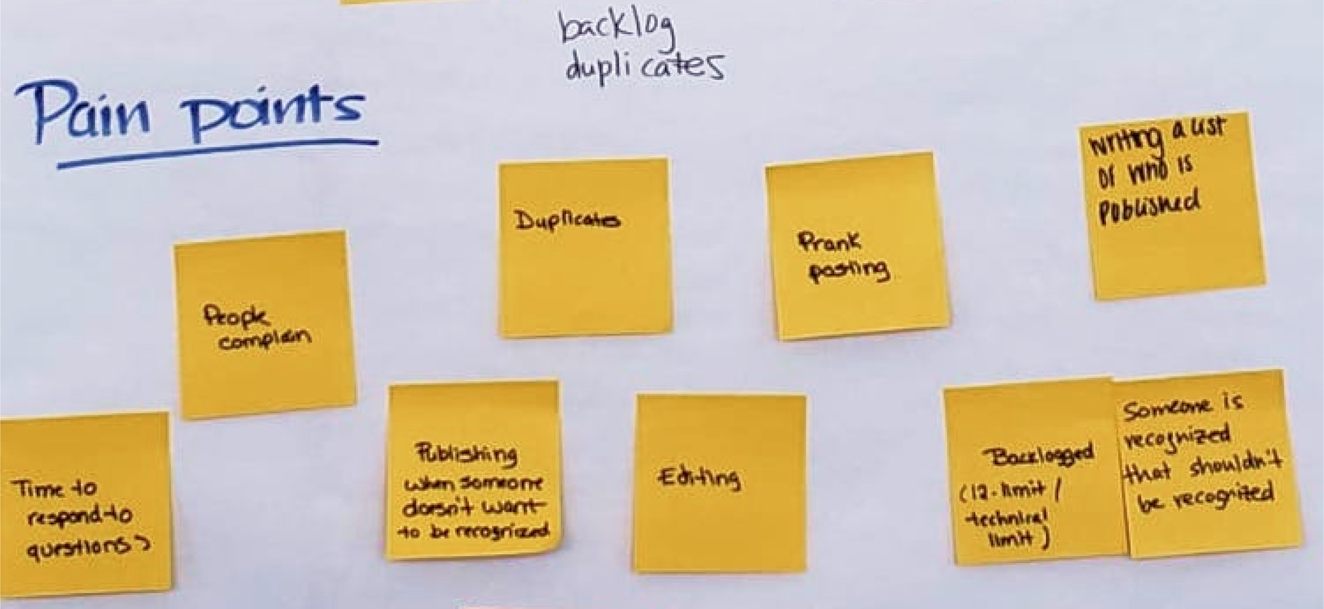
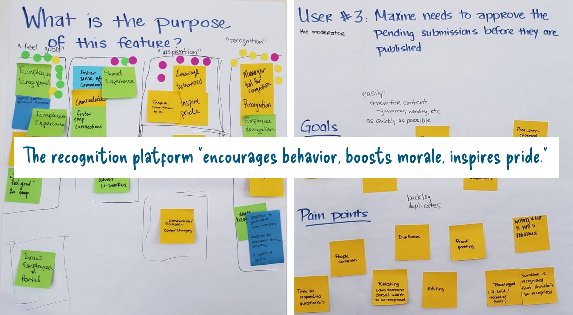
To better understand the problem, I co-led a discovery workshop with the UX architect. Together, we collected insights from the product owner, active moderators, and employee users about their goals and frustrations.

Define
During the session, we did a deep dive into the platform's purpose: Was the recognition tool even necessary? While employees did see the value in celebrating their peers, many felt discouraged from giving recognition because publishing was so delayed. Moderators, on the other hand, were overwhelmed by duplicate submissions and lacked the tools to manage them efficiently.
Ideation
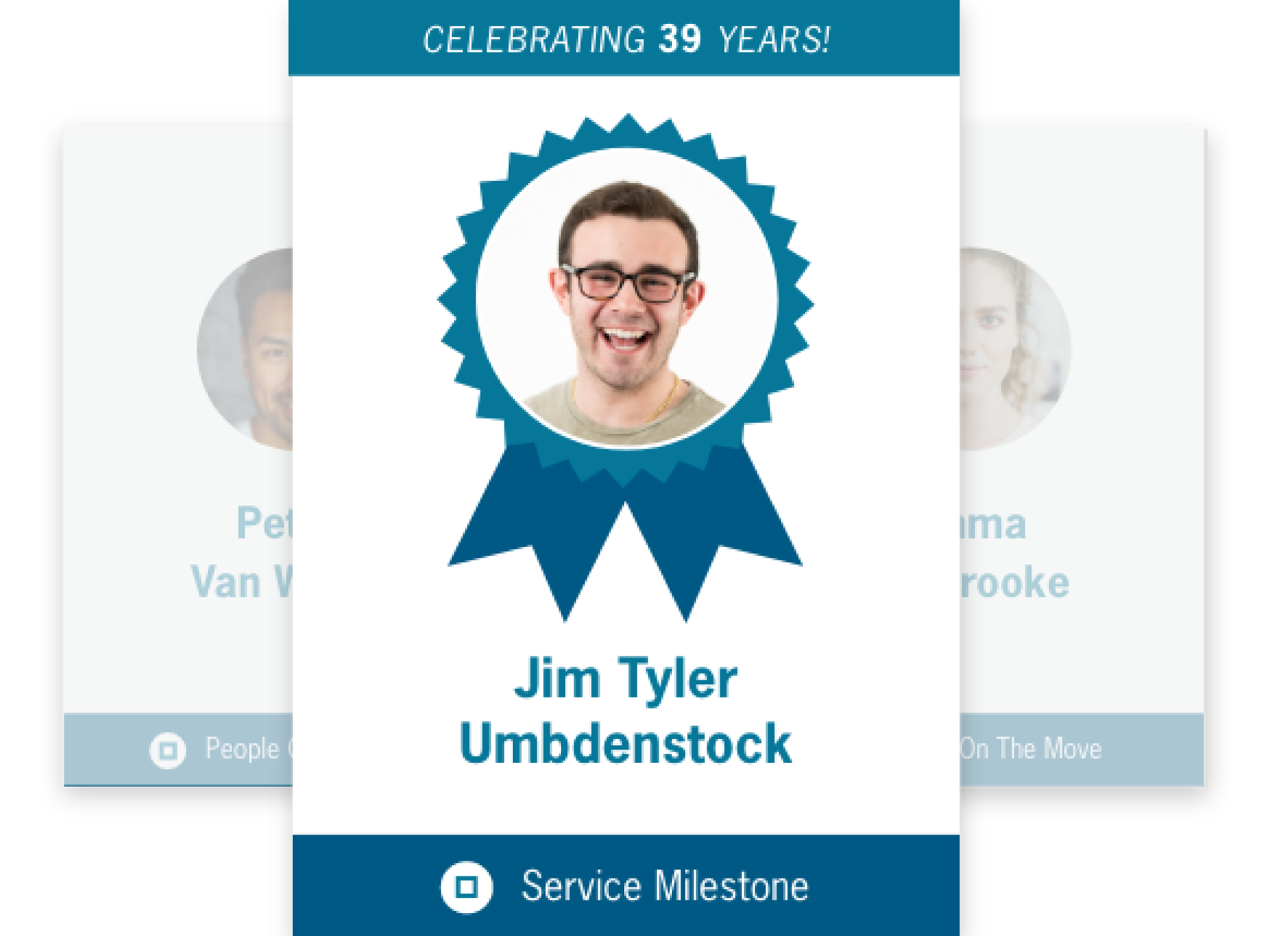
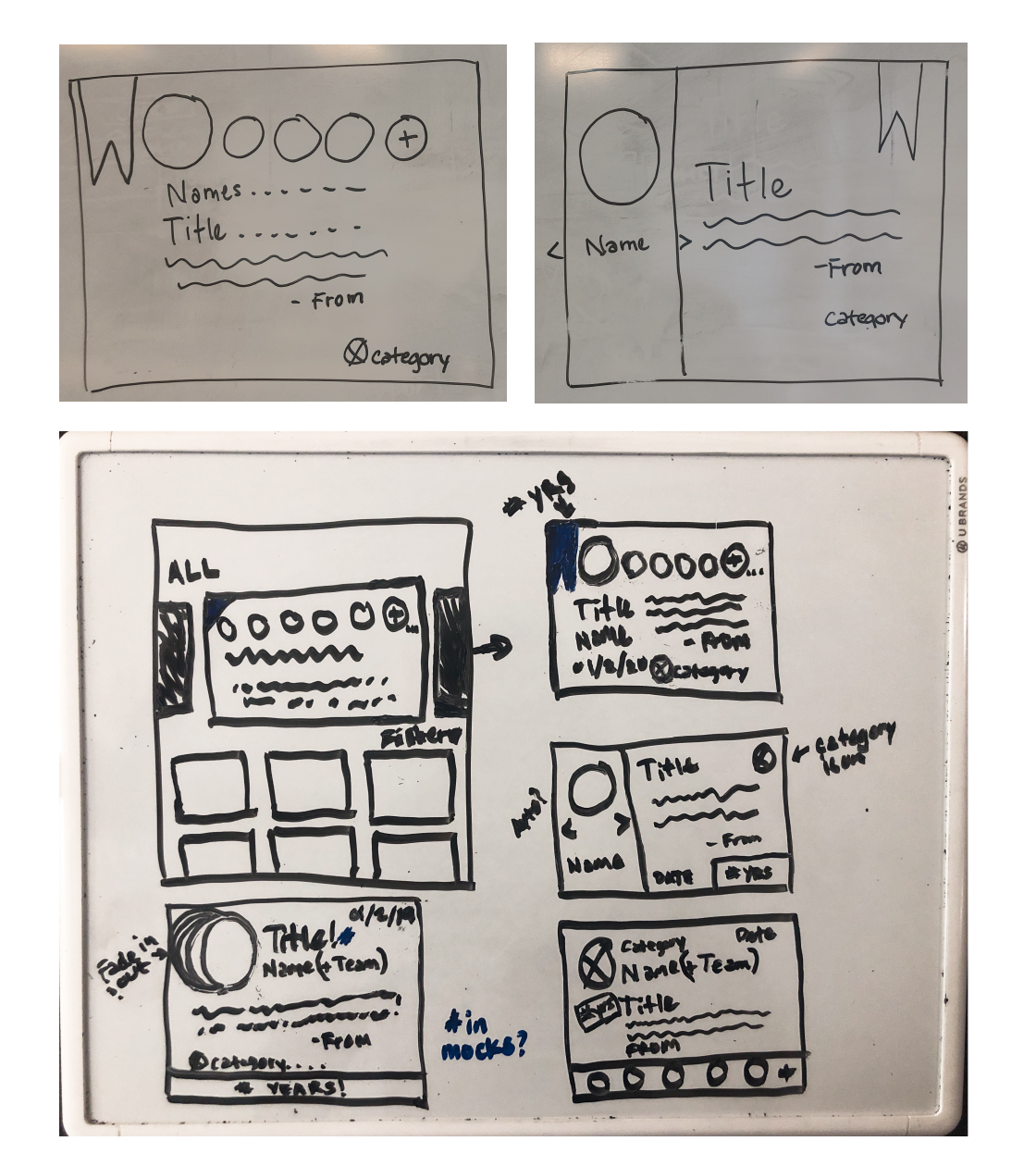
To align on scope, we did a Crazy 8’s exercise to brainstorm solution ideas. Using the team’s ideas as direction, I created whiteboard wireframes to explore layouts. I focused on the recognition cards first, since their size and format would shape how much content we could display. The priority was to highlight as many employees as possible while keeping the layout clean and scannable. I also explored a “group post” option to help reduce backlog and ensure more employees were seen.
Design
I transitioned the sketched ideas into more refined wireframes in Adobe XD, focusing on space-saving components like thumbnail cards and group recognition modules to showcase more employees without overwhelming the page.
Next, I designed high-fidelity mockups using the client’s existing brand guidelines. After iterating feedback from the UX architect, I constructed interactive prototypes to show how specific interactions, like navigating through a group post or clicking on a thumbnail. Each design decision was made with users in mind—from thumbnail cards that reduced clutter for viewers, to grouped recognitions that made it easier for moderators to manage submissions.

Validation
The new design increased visibility from 12 to 32 recognitions on the homepage, helping more employees feel acknowledged. The simplified card view also made it easier for users to scan recognitions without feeling overwhelmed.
Reflection
This project reminded me how powerful UX can be in restoring human connection, even within enterprise tools. I left the client with recommendations to test additional filters and sorting options in the future to help users find specific recognitions faster. Thoughtful improvements like these can ensure the platform continues to scale without losing its personal touch.